Nexity estate agent application
- 6 Jan 2021
- Field research, User testing
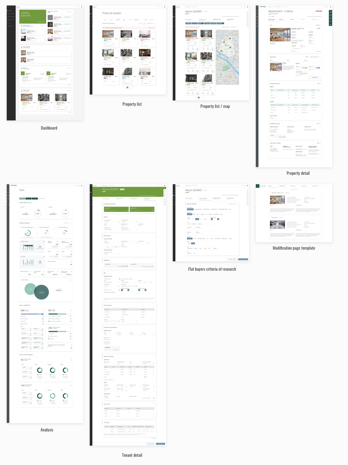
Nexity is a major European real estate development company. Their estate agents and other employees used an application that was outdated compared to modern user interfaces and suffered from performance issues. They reached out to Pocket Prod to re-design the application before building it from scratch.
 Jumping into co-design
The project team was made of a solid group of 6 people: technical staff, directors and experts from the field.
With the agency director we started analysing client inputs. It turned out they had already made some wireframes previous to our collaboration. We planned a couple of weekly co-design workshops and then had to deliver interfaces for developers in a timely manner
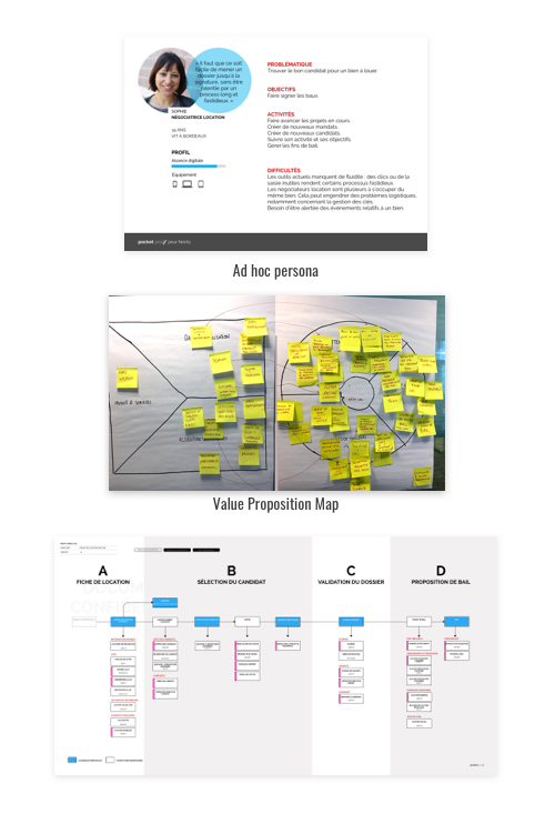
We kickstarted our workshops by prioritizing subjects and using design artefacts such as persona, empathy and journeys maps. This way we could grasp the essentiel challenges and line up the project team in a common direction.
It was only during the third week that we started drafting sketches on a whiteboard and iterating on key screens and user journeys. In a three hour workshop we would usually deal with two user journeys. We did our best to keep things visual using printed A4 screens on the wall, animating silent post-it critic exercises as a supplement to the Invision prototype.
One of the main challenges of the project was to a certain extent the lack of knowledge of real-life user situations. It was easy for the project teams to explain the process and how things work on paper, but how do estate agents operate in daily life? We went forward based on assumptions and the team expertise.
My colleague UI Designer Yaelle Cannamela then added life to my wireframes and we were ready for the next challenge.
Testing
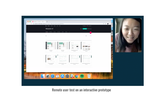
Testing is always my favorite part of a project. Seeing users interact with your prototype is so gratifying, when things work as planned and everything clicks together. And even when they don’t, we learn why they didn’t, thereby giving us a chance to correct the shot. A dozen one-to-one user tests took place in our office. Whilst I conducted the tests, my colleague was in the Nexity headquarters watching it live with the project team (this was during the Covid 19 lockdown). This way we could track down the improvements to be made and, most of all, decide instantly: always pushing methods that aggregate thoughts and speed up the process.
The project team was satisfied to see end users share positive feedback on the new designs, knowing that the news would spread internally that Nexity was launching a more modern, user friendly application for stakeholders. The prototype was then updated and we delivered all assets for developers.
Pushing Boundaries
Shortly after the project ended, the project team asked us how we would have done it differently if we had to do it again. I believe that we all knew the answer was holding relevant field research since we frequently spoke about it during the previous project. The client was satisfied with our work and asked us to intervene on developing another similar application, so we helped them build the ideal Design Methodology for it.
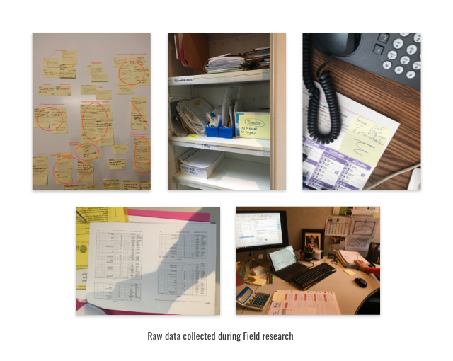
We kickstarted this project with internal interviews to understand the staff’s perception at the headquarters before doing field research visiting local agencies. With another UX designer, we spent four days in Grenoble and Strasbourg discovering the scope of work of local estate agents. We conducted informal interviews and made direct observations necessary to understanding how they interacted with their environment.
We grasped what drove the different users and were able to design an application using powerful insights that made the whole design process much more fluid than the previous one.
